Choose a living-room appearance question
Two bulbs with the same stated lumen output can make a living room feel different in appearance. You may prefer how one renders the wall, a cushion or an open book, yet dislike the other beside existing lights. Compare two permitted bulbs in the same fitting and record those preferences directly. This exercise makes no claim about sleep, health, concentration or energy savings.
Write down the decision before opening the packages: which appearance suits reading and conversation at the usual evening seat, or which keeps the wall and upholstery looking agreeable together? Do not attempt a professional colour-matching judgment with this method. Household materials and your own perception are the subject.
Choose one ordinary lamp that accepts user-replaceable bulbs and has readable instructions. If the light source is integrated, inaccessible or not intended for user replacement, do not dismantle it for the comparison. A dimmer-controlled circuit requires bulbs compatible with the dimmer and fitting. If you cannot establish compatibility, leave the comparison pending rather than experimenting.
Match output and check the permitted fit
Read the lamp instructions and both bulb labels. Check the cap, supply specification, physical size, bulb type, enclosure restrictions and maximum actual wattage. A bulb that physically screws in is not automatically permitted. Keep packaging so the ratings remain available after the trial. Use only intact products from a reliable source.
The FTC explains the difference between lumen output and electrical wattage, and describes the Kelvin appearance scale. Those are the label fields needed here. For example, you might compare a permitted 2700 K bulb with a permitted 4000 K bulb, both marked 800 lumens. The figures are comparison choices, not recommended settings for every living room.
Try to match bulb shape, finish, beam distribution and stated colour-rendering information as well as lumens. If those differ, list them. Matching rated output does not guarantee identical light at the sofa because shades and bulb distribution affect where light goes. YourHome offers broader lighting context; this trial deliberately keeps the room and fitting fixed.
Set a repeatable evening scene
Choose a time when daylight will not change the room during the comparison. Leave curtains, furniture and the shade in their usual positions. Put a plain page, a patterned cushion and a familiar coloured object where you normally see them. Avoid using a phone screen as the colour reference; its own display settings complicate the comparison.
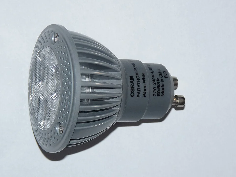
The base and printed colour description show product details to identify before setting up the comparison. Use compatible bulbs and the intended fixture, keep the room, shade and occupied view unchanged, and obtain lumen information from the actual product documentation. This unlit photograph does not demonstrate colour appearance, matched light output or a universally compatible replacement.
Photo & usage
Dmitry G · CC BY-SA 3.0 · Source. Display copies resized and encoded as WebP; no instructional details were fabricated or removed.
Decide whether other room lights stay on. Keeping them on answers how the candidate works in your usual mixed-light scene. Switching them off answers how it looks alone. Either can be useful, but do not mix the two questions within the first circuit. Note the chosen switch settings and repeat them for the second bulb.
Use the same seat and page angle. Give yourself time to settle into each scene rather than deciding from the first instant after switching. Record impressions in words such as cream wall looks more yellow or blue cushion appears duller. Avoid assigning an objective colour-accuracy score to an unaided preference. A photograph with automatic white balance can neutralise the very difference you are checking.
Change bulbs with the fitting safely isolated
For a portable lamp, switch off, unplug and let the bulb cool before handling it. Follow the fitting instructions for replacement. Fixed fittings need their specified isolation procedure; if you do not know it or cannot access the fitting safely, use an appropriate portable lamp instead. Never change a bulb on an unstable chair.
Install the first permitted bulb, return the shade correctly and operate the lamp normally. Record the scene. Isolate and cool it again before installing the second. Keep fingers and objects out of the socket, and do not touch internal electrical parts. Stop if you find damage, discolouration or an insecure holder; that is a repair issue rather than an appearance trial.
If using a permitted dimmer, keep the same repeatable setting for both, preferably a clearly identifiable setting the products support. Equal knob position need not mean equal output between bulbs. A dimmed comparison therefore has an extra limitation. Visible flicker, unexpected behaviour or incompatibility is a reason to stop that combination and consult the supplier.
Read an illustrative matched-output record
This invented example compares two bulbs permitted by one table lamp’s instructions. Both are labelled 800 lumens and 8 W; one is 2700 K and the other 4000 K. Their other recorded features match. The following observations are invented personal preferences, not laboratory results.
| Check from sofa | 2700 K candidate | 4000 K candidate |
|---|---|---|
| Cream wall | Warmer-looking cream preferred | Paler-looking cream |
| Blue cushion | Acceptable | Preferred appearance |
| Book page | Comfortable in normal posture | Comfortable in normal posture |
| Beside existing room light | Blend preferred | Difference between lights conspicuous |
The rated lumen difference is 800 minus 800 = 0 lumens. The appearance-label difference is 4000 minus 2700 = 1300 K. The latter is not a measure of how much better one bulb is, and 4000 divided by 2700 would not give a meaningful percentage improvement in whiteness. Do not convert a Kelvin label difference into a comfort score.
For this invented household, the first candidate wins the stated mixed-room preference even though the cushion looks preferable under the second. A household focused on the cushion could decide differently. The page observations also show why an appearance preference should not be described as an improvement in task visibility when both candidates served that task similarly.
Repeat before keeping the preferred bulb
If the decision matters, repeat another evening with the order reversed. A first candidate can become a mental reference that biases the second. Ask another regular occupant to make their own short notes before discussing preferences. Agreement is useful, but disagreement is information about shared use rather than evidence that somebody judged incorrectly.
Check the normal range of seats. A bulb with a different luminous shape can become visible below the shade from a low sofa even when the lumen label matches. CCOHS lighting guidance is useful here as a reminder to inspect the visual arrangement. Direct glare and a preferred wall colour can coexist; the colour preference does not excuse the glare.
Common errors include comparing different lumen ratings, leaving one shade off, changing dimmer positions and judging from processed photographs. Also avoid assuming a higher Kelvin number means a brighter bulb. If a second bulb produces a visibly different beam, retain that limitation in the record instead of presenting the trial as a pure colour-only experiment.
Finish with the label and the actual preference
Keep the preferred permitted bulb installed correctly and store the other safely in its packaging if it will be retained. Record the complete product identification, rated output, appearance label and fitting restrictions. A future bulb with the same Kelvin number may differ in other ways, so keep the relevant packaging details rather than only the colour name.
Completion means the electrical and physical compatibility checks were made, the room conditions were repeated, and the decision names the objects and activities behind it. If the household remains divided, a separate existing lamp used at different times may be worth comparing within its own instructions. Do not imply that this room trial establishes a universal best colour appearance or a benefit beyond the observations recorded.
THE REFERENCE FILE
Sources & scope
Documentation reviewed 1 Nov 2026. Examples are illustrative; this article does not claim hands-on product testing. Follow the instructions for your actual material, model and location.